
My Home
This project was my Capstone during my UX course at Springboard to explore all of the design processes of UI/UX Design. I had always had a passion for interior design and saw an opportunity to explore that with this application. My Home is an application to help you design your space as if you are an interior designer. It will stop the struggle of cross-referencing different websites, the pain of searching for months for the perfect piece, and the hopelessness of never finding furniture that meets your style. My Home will do the work for you to make designing your home easy.
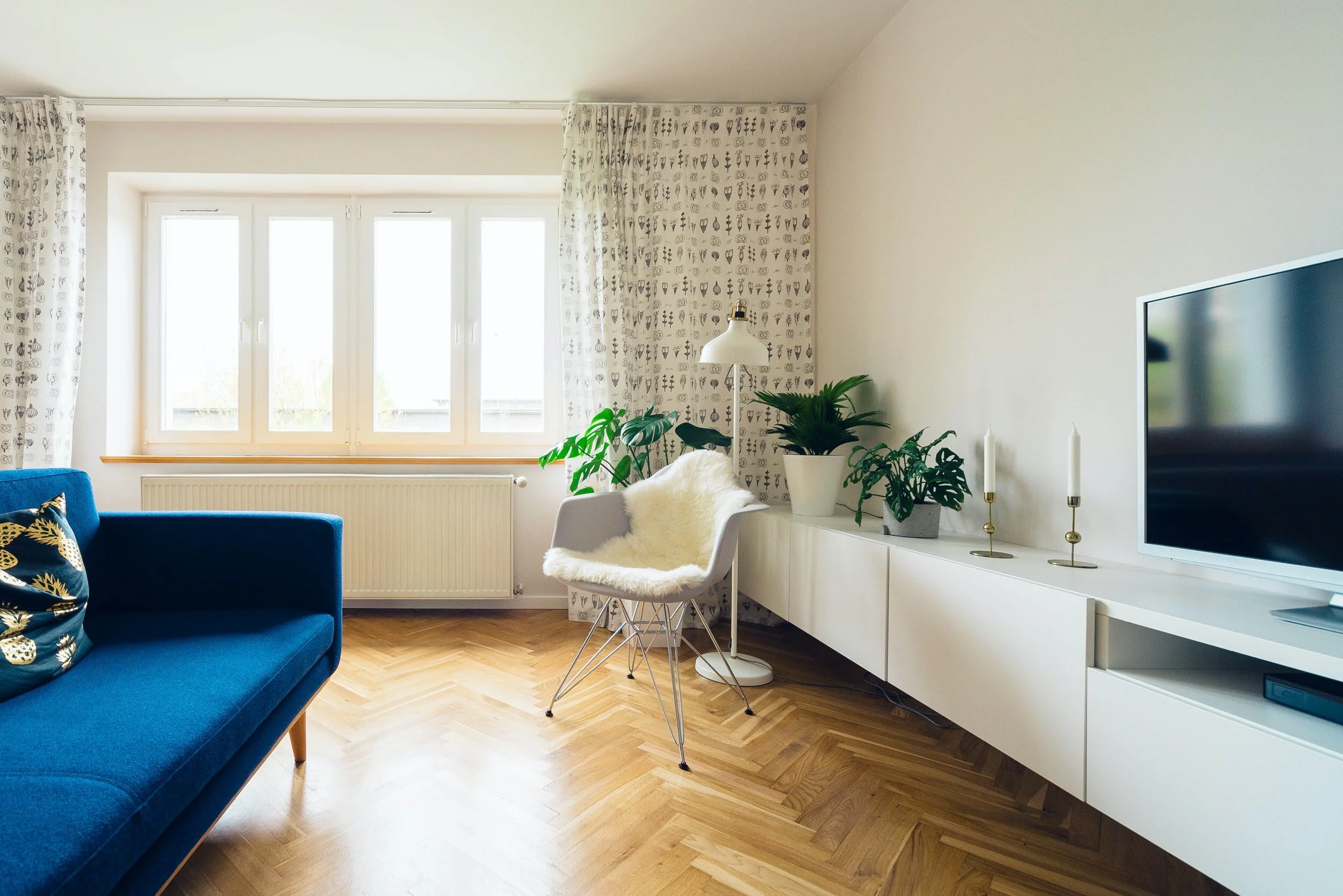
Interior Design is NOT for Everyone
In 2019, the number of interior design jobs was 77,900 with a median annual income of $56,040 in the U.S. and in order to get a job in that field, you usually need a bachelor’s degree with a focus on interior design. That leaves millions of people without the knowledge of interior design expected to either pay lots of money for an interior designer or to make their homes aesthetically pleasing by themselves.

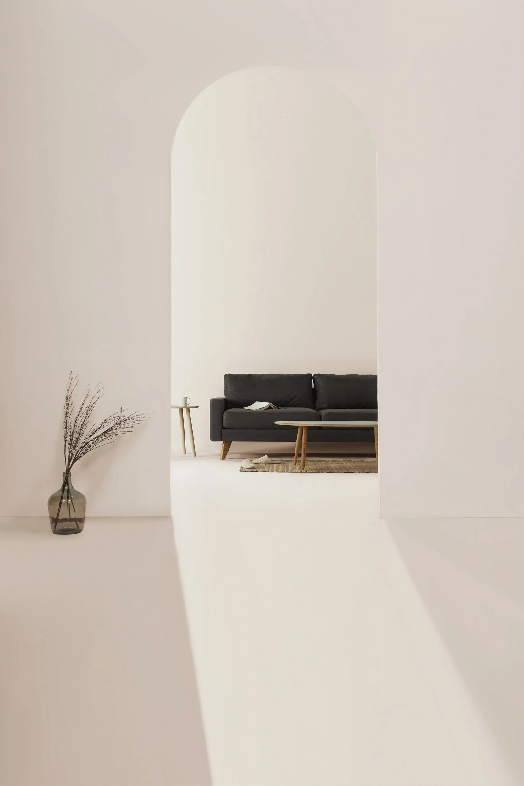
Photo: Christine Pelton
VS

Photo: François Dishinger (Architectural Digest)
The Solution
This application was created to be able to design and create interiors by yourself, meaning it had to be convenient and uncomplicated. This meant I had to take an evaluation-heavy human-centered design approach to reduce confusion and lack of interest.
My Role
Since this was my Capstone project while I was at Springboard, my role was to manage the entire UX/UI process throughout the development to the completion of this application. The subject of this application was of my picking and has been a passion project of mine for a while.
Starting with the Basics
What is already out there?

Only room layout design tool and does not help with aesthetics
All on your own
Has a “we decorate for you” option that costs extra on top of tool
Links to brands
Still need to collaborate with interior designers which is an added cost and can get expensive
Has an immersive room capability
Website is hard to work
Links to brands

Still need to collaborate with interior designers which is an added cost and can get expensive
Only 3 design options
Designers only work with what you need (an extra chair, coffee table, etc)
Links to brands

Interviews
To better understand and gain empathy for my target audience, I conducted six different interviews each for an hour over Zoom with those who had completed my survey and redesigned their spaces within the last 2 years without the help of an interior designer.
Who Am I Designing For?

“I will not buy something without reviews.”
“Furniture needs to last and be sturdy to spend a lot.”
Personas
After my interviews, I learned I was designing this application for three separate personas; the home owner, the renter and the budgeter. Each having their own motivations and goals when designing their interior.


How Might We…
How might we help provide solutions for both renters and home-owners?
How might we help people on a budget find creativity with the furniture they already have?
How might we create a one-stop-shop for users so they don't need cross-reference different websites?
How might we help people visualize what they are looking for so they can have a process and an end result?
The Design Process

Ideating about the most interesting and obscure ways to solve my how might we questions that could set this application apart. To get my most creative ideas, I wanted to get everyone out of my head and on paper even if the idea would so wild that it would never work.

Ideation - User Flows - Sketching
User Flows

Trash or Keep
People can now save time and money by using this app to figure out whether to trash or update their old furniture.

Inspire Me
People’s one-stop-shop with ways to look at inspiration, get suggestions, browse and purchase new furniture.
Sketches

First draft had a welcoming “what would you like to do today?” which took too much space for important content
Users wanted to get right to shopping and did not like these added tasks to get there
Originally had a menu at the bottom of every page but quickly changed to not have users distracted

Second draft added the carousel of content that users could click through but they needed a way to see each page up front
People did not look for Trash or Keep in the Explore page
The Design Process
Wireframing
Translating my sketches with the basic layout and structure into low fidelity wireframes using Sketch and InVision to test my theories at this point.

Mood Boards
I wanted to keep my UI simple since my content would be mostly pictures and very colorful itself. I ended up creating two moodboards with neutrality in mind but ended up choosing my first option to have only black and white content with a very vibrant orange color to highlight specific content.


Usability Testing
After two rounds of testing, I found that my application needed some improvements. During each of my tests, I asked volunteers a series of questions that would test if my application was intuitive.

Before
People went to the wrong page for the “Jazz Up my Room” button because they didn’t understand what it meant
Users had to keep hitting the back button to get all the way home

After
Added an entire home page with verbiage explaining what “Jazz Up My Room” meant
Added a home button

Before
Home screen carousel of “advertisements”
Inspire page was confusing to some (did it mean to get inspiration or to give inspiration?)

After
Home screens become the three main pages (My Home, Inspire Me, Explore) with content
Inspire Me page
The Final Product

To expand my application to make it even better, I would test again to see if my predictions were correct with the home screen and combining my two features into one screen to make sure my application is more intuitive. I would also like to expand on the profile page to make it different from the “My Interior” and still hold new and important information.
